Realistic drawing rather than cartoon
I chose realistic proportions rather than a cartoon style, because these animals exist and children can meet them at the sanctuary.
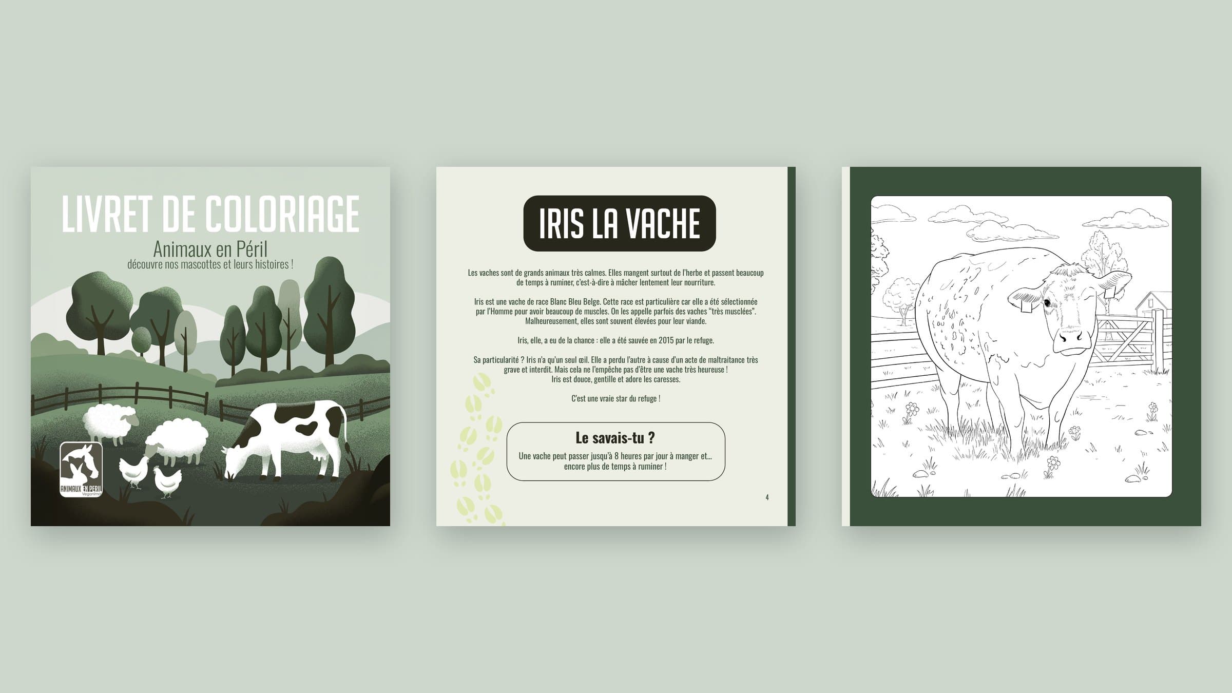
Pl. 03 / 13Case study
A 20-page colouring booklet introducing seven sanctuary animals, drawn on a graphics tablet.
Motion design presentation, 15 s: the booklet is flipped through in 3D, page by page. Animation and soundtrack written in code, from the booklet’s real pages.
Animaux en Péril, a Belgian sanctuary for equines and farm animals, wanted a colouring booklet for children. It had to present several animals living at the sanctuary, each with a rescue story. The association supplied the texts and photos of each animal.
Each animal has a real distinctive trait: a single eye, a folded ear, large horns, a tongue sticking out. The drawings had to show them clearly while staying easy for a child to colour.
I read the association’s texts, sorted the photos of each animal and built a brandbook from the sanctuary website guidelines. For each animal I noted the distinctive trait to make visible.
The Iris illustration served as the model: black line, white background, farm setting, realistic proportions. The other animals were drawn in the same style.
One drawing per animal from the sanctuary’s photos: I draw the animal, then its setting, in Photoshop on a graphics tablet, checking the distinctive trait on each page. Jerry the rooster was added to the six animals in the original brief.
Vector illustration in Illustrator, inspired by graphic styles found on Pinterest and faithful to the sanctuary’s art direction. The photos of Jerry were sent by the association.
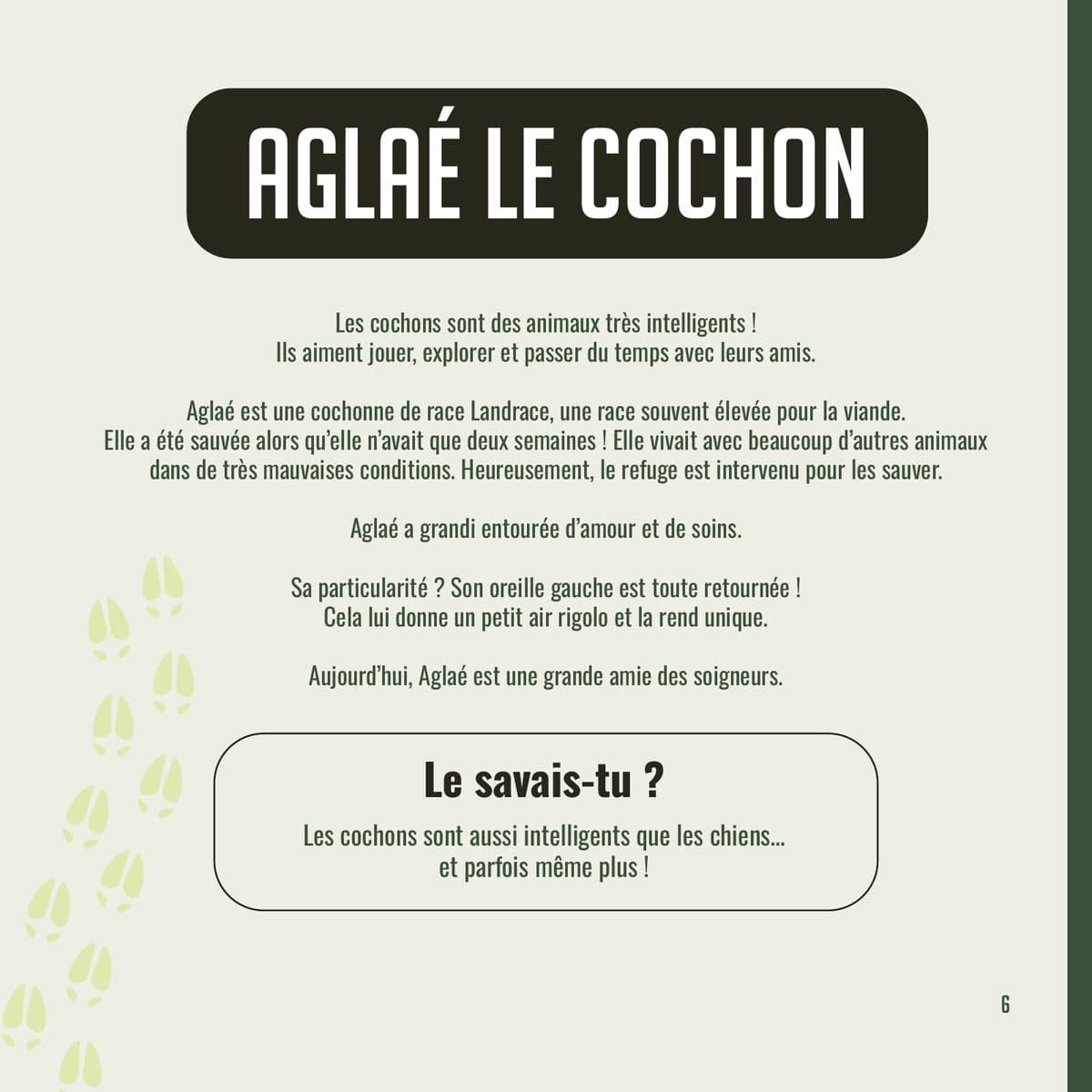
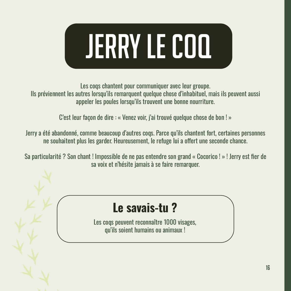
I built the booklet in InDesign in a 22 × 22 cm square format. Five review versions were exported, from Reviews to v5.
Final PDF and print versions with bleed exported on 14 July 2026. The association had the booklet printed by its own supplier.
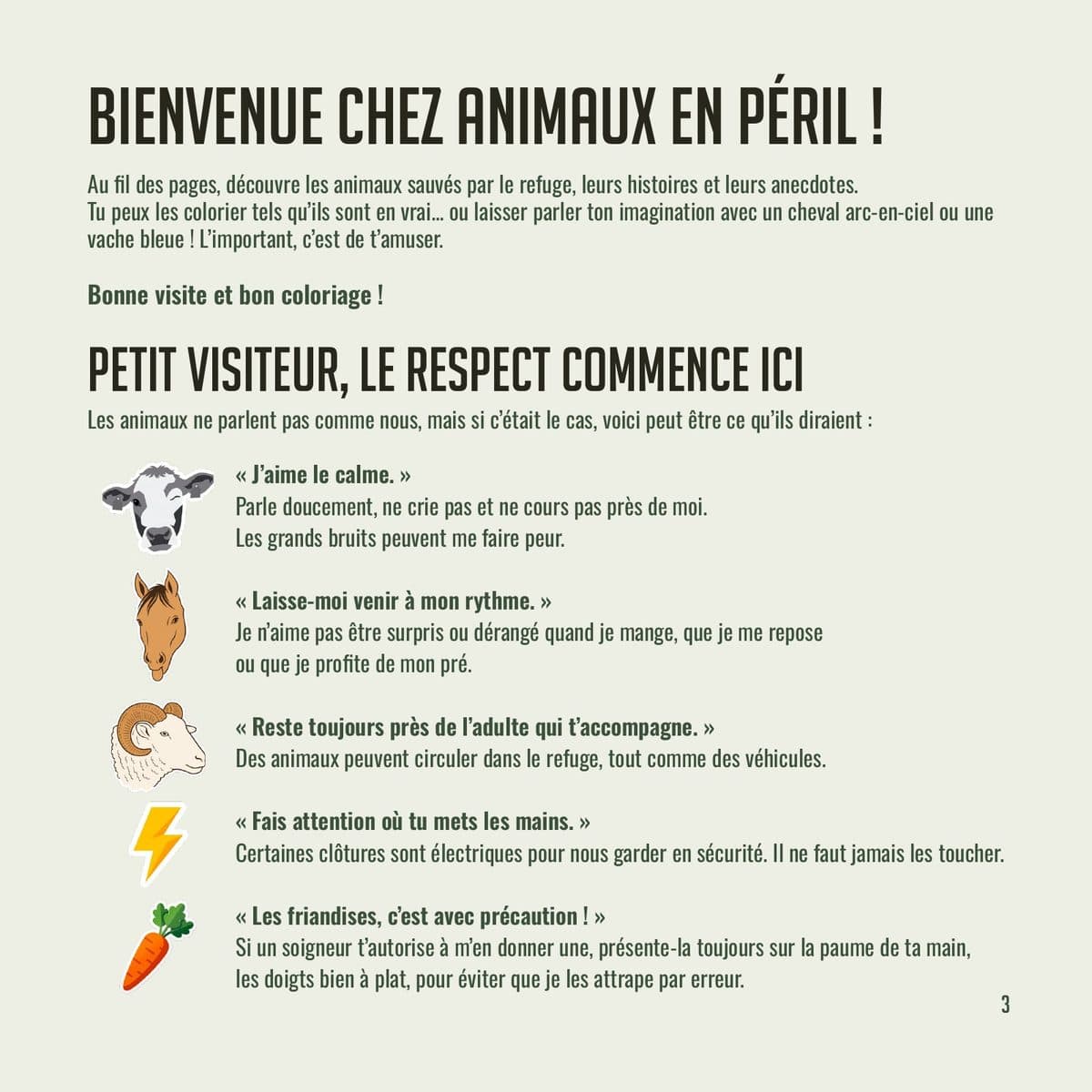
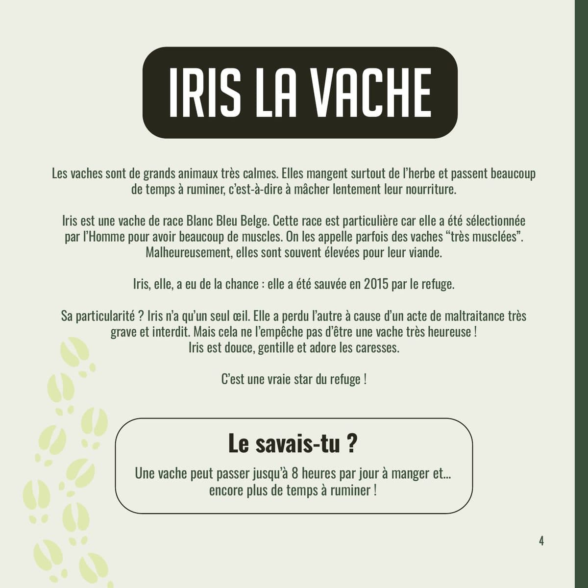
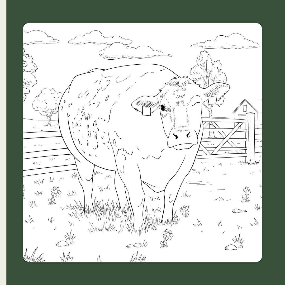
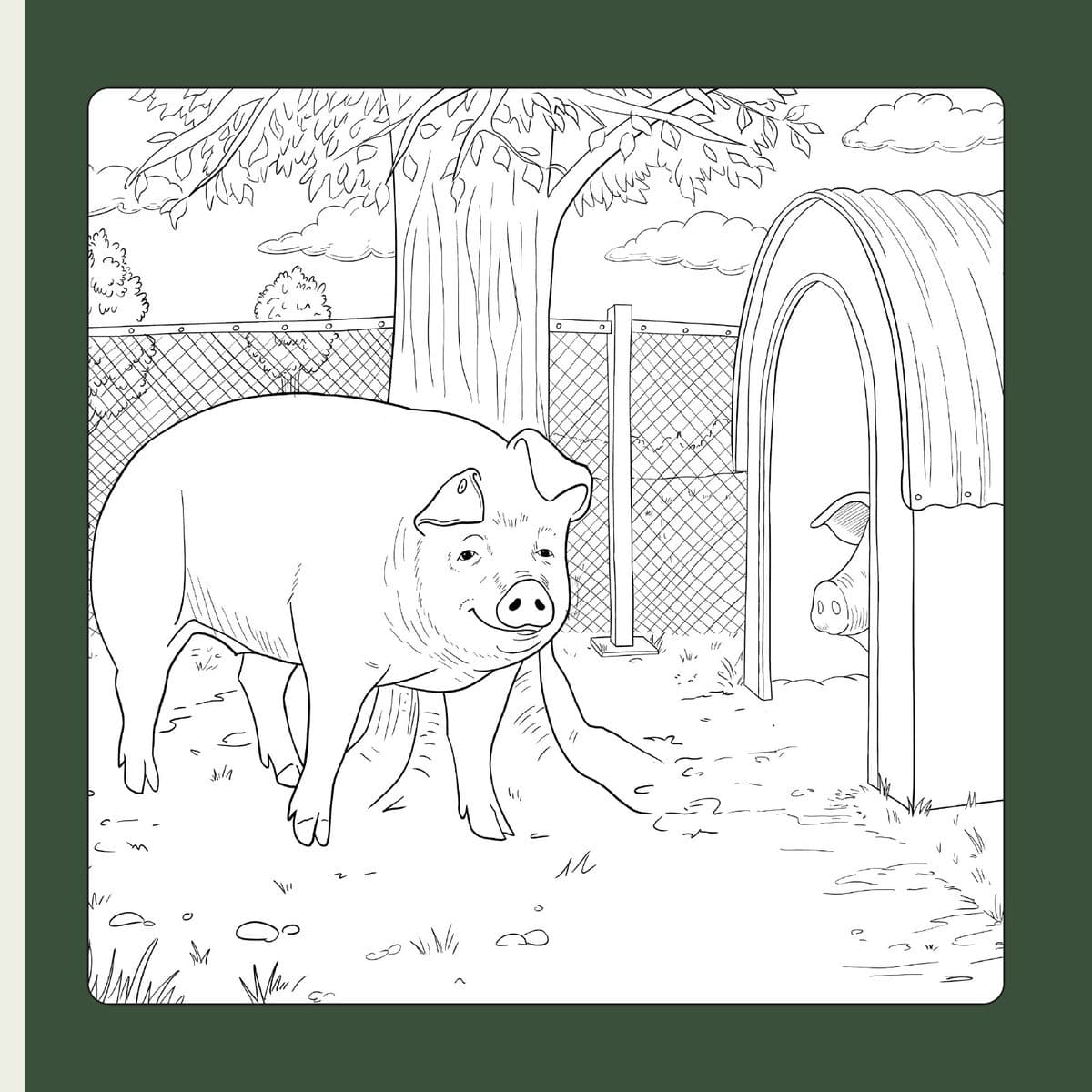
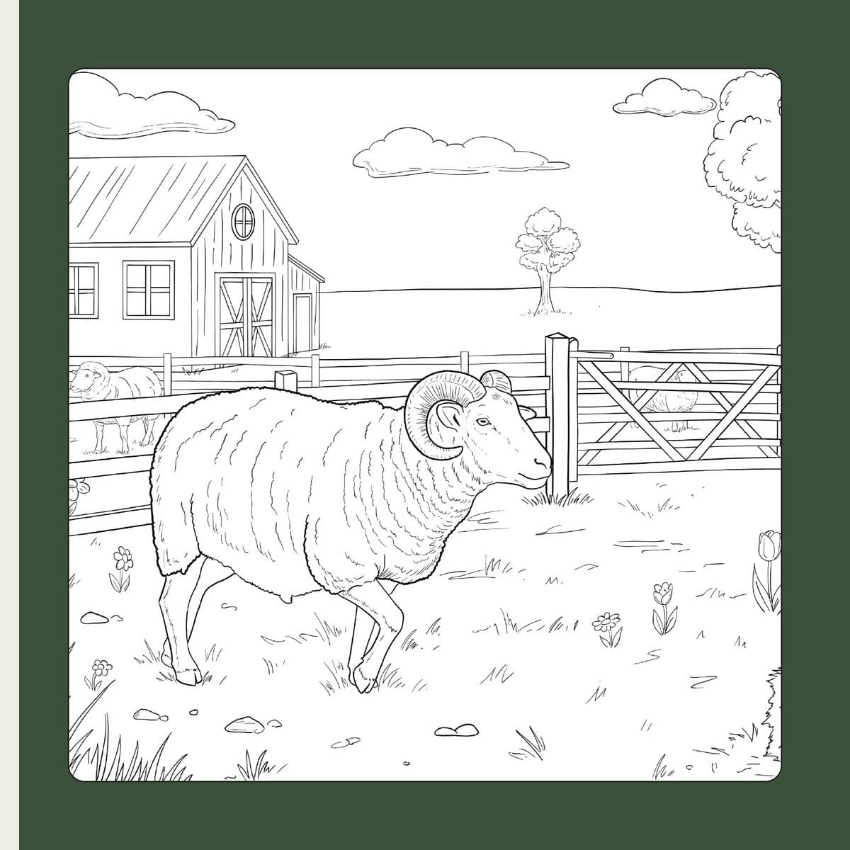
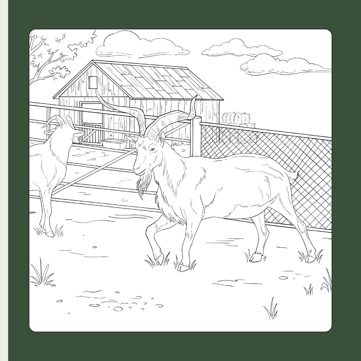
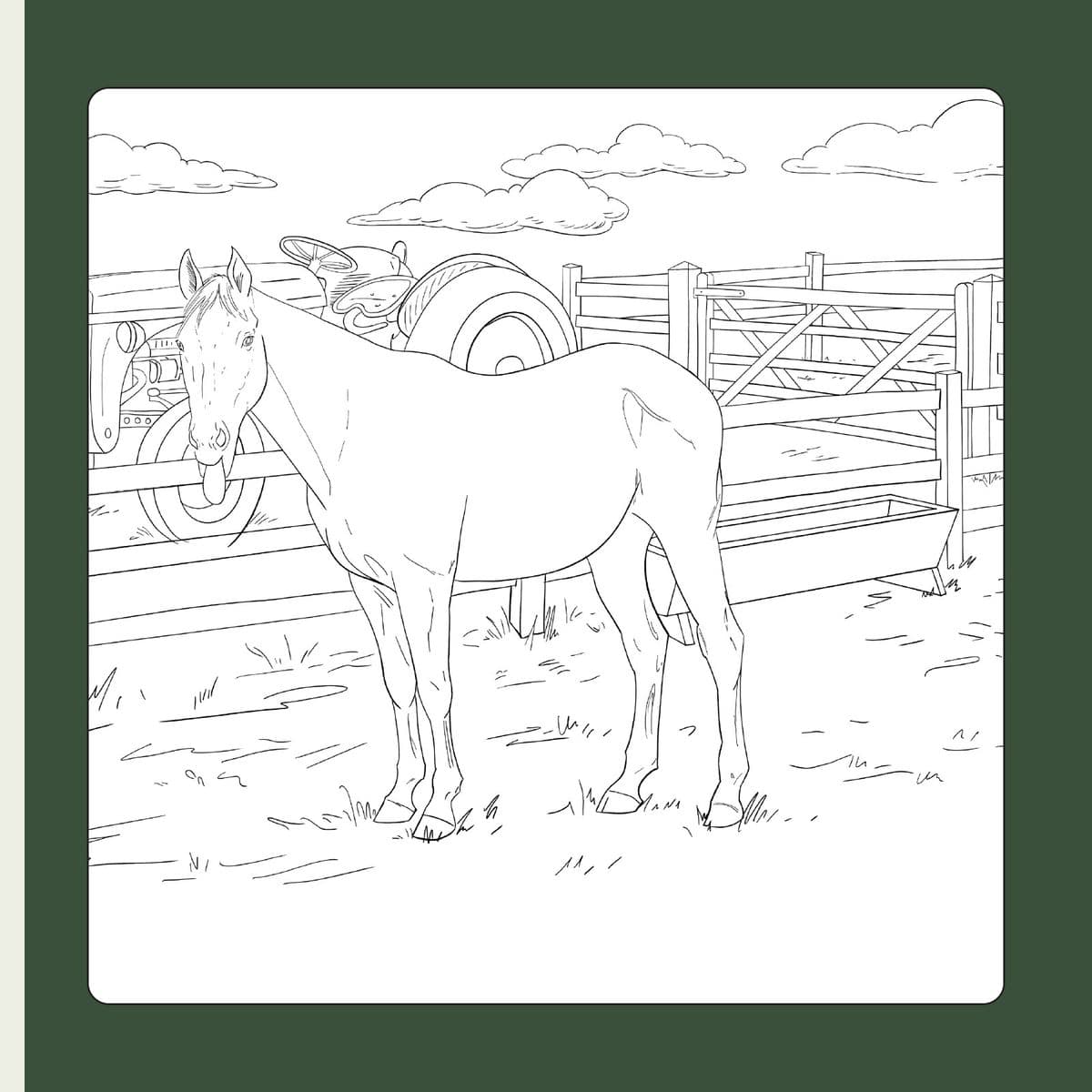
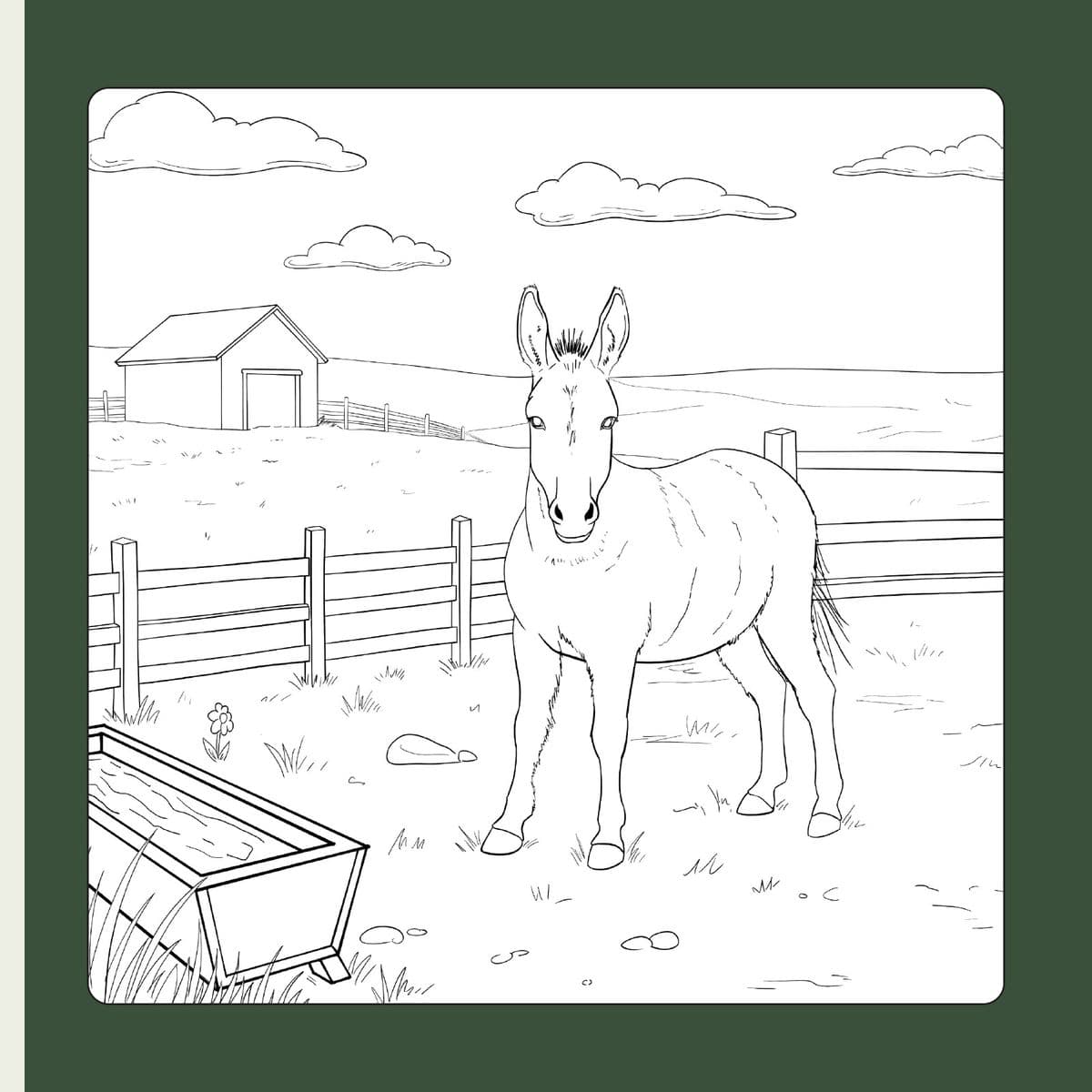
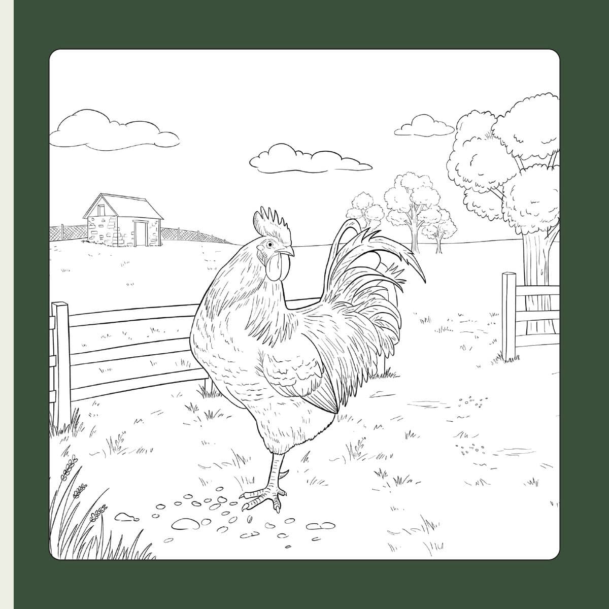
I chose realistic proportions rather than a cartoon style, because these animals exist and children can meet them at the sanctuary.
I made each animal’s distinctive trait the focus of the drawing rather than a discreet detail, because it is what tells its story.
I used the greens and black of the association’s identity rather than a bright children’s palette, because the booklet has to stay consistent with it.
“Thank you for the booklet! The drawings are beautiful, it’s exactly what we were hoping to do!”
Animaux en Péril ASBL
Colours sampled from the project visuals.