The name caught in the ropes
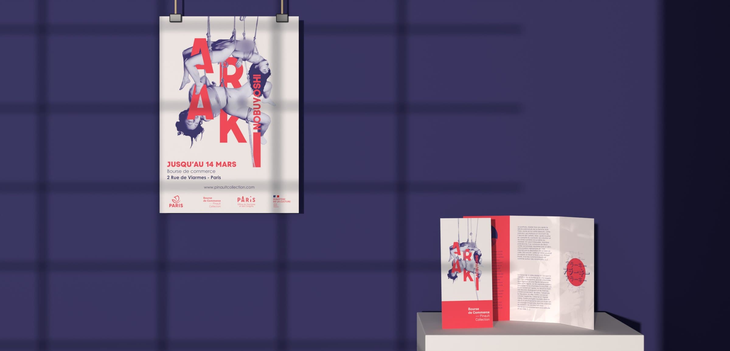
I ran the letters of ARAKI in front of and behind the ropes rather than laying the title over the image, so that the artist’s name and his subject read at a single glance. The name seems suspended with the bodies.
Pl. 01 / 13Case study
An A3 poster and a roll-fold leaflet for a fictional exhibition of the photographer’s work, from cut-out to print-ready file.
Presentation film made in 2026 for this portfolio, based on the project’s guidelines.
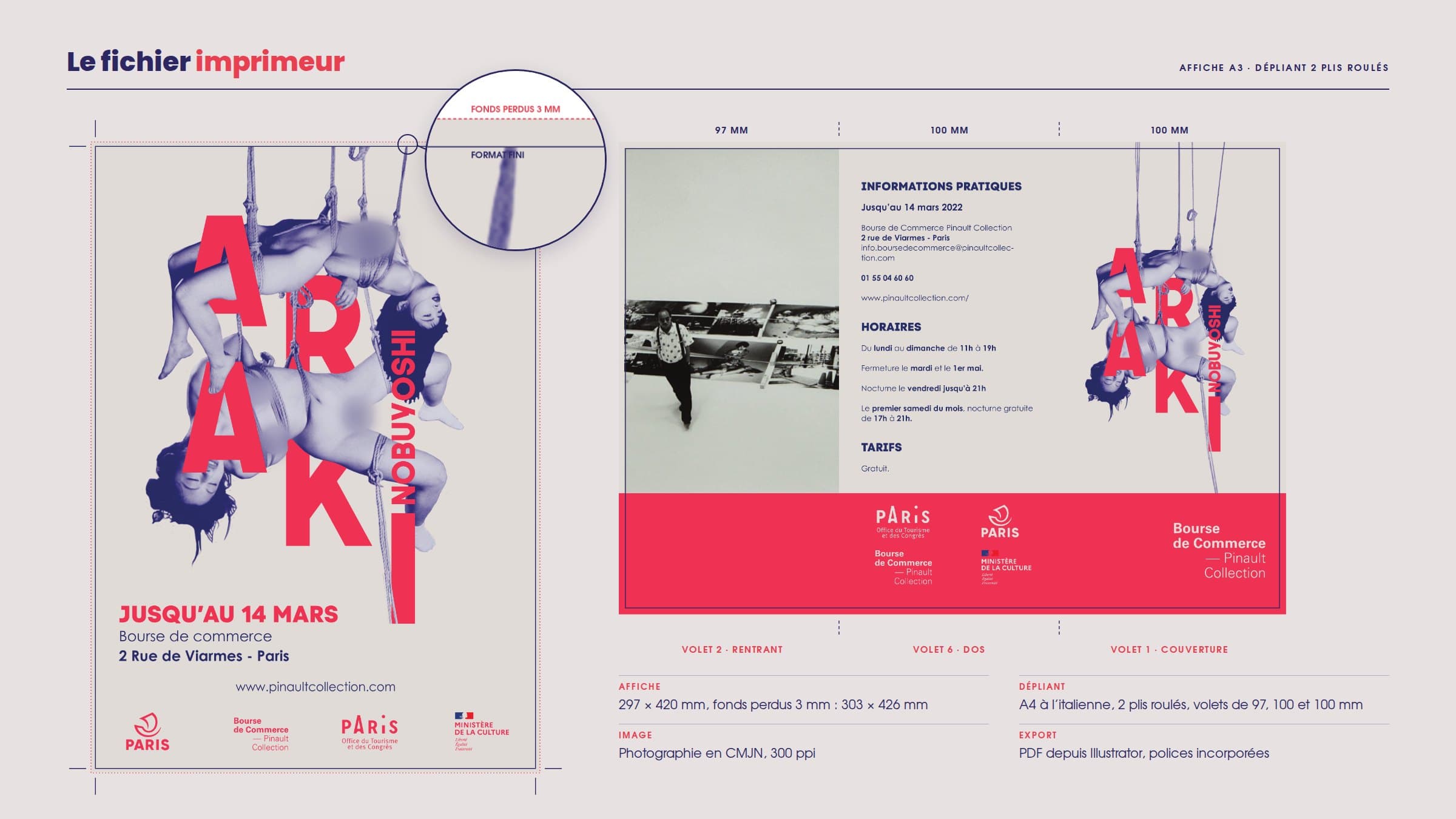
The brief: design the printed communication for a fictional exhibition of a photographer drawn at random, hosted by the Bourse de Commerce – Pinault Collection in Paris. I drew Nobuyoshi Araki. The official partners’ logos, the critical text and the leaflet template were supplied. The poster and leaflet had to be delivered print-ready, then printed in the school’s print room.
Araki photographs the body, desire and grief, often through kinbaku, the Japanese art of rope bondage. The poster had to own that subject and stay readable from a distance, and the files had to print right the first time.
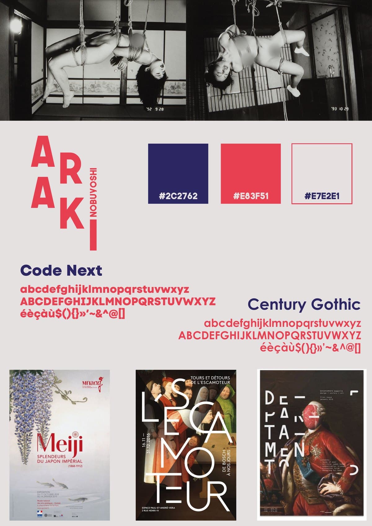
In February, I gathered reference exhibition posters (Meiji at the Musée Guimet, L’Escamoteur, Departamento) and ran first tests around the red circle and the ropes.
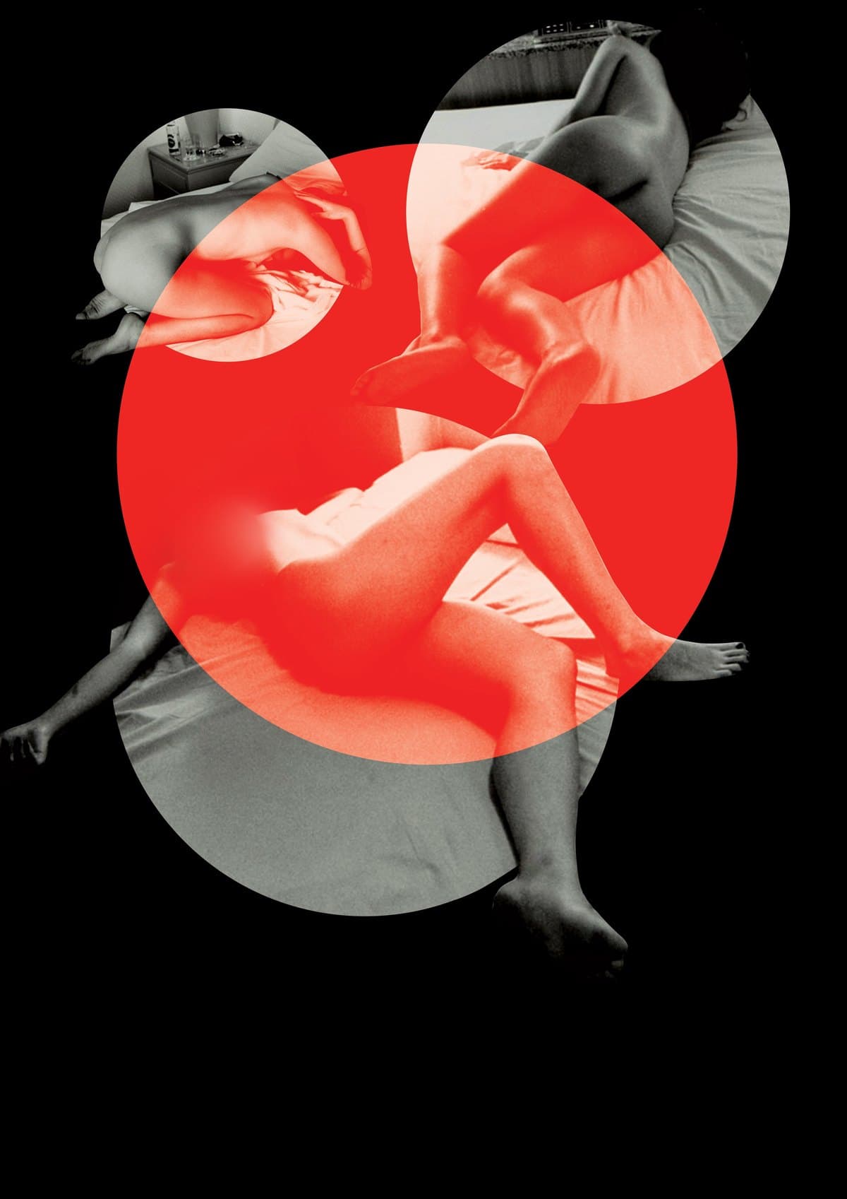
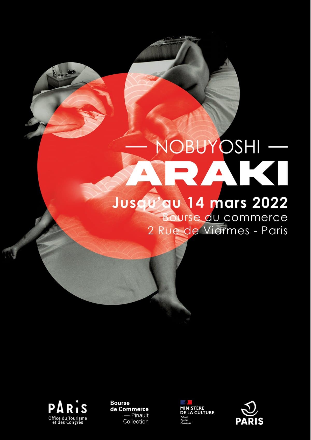
In early March, a first poster on a black background: a red disc, photographs in round frames and a centred title.
In mid-March, I cut out two photographs, bodies and ropes, then turned them into a night-blue and red duotone on a paper background.
The name ARAKI slid into the ropes. The leaflet was built on the supplied roll-fold template: cover taken from the poster, practical information on the back, critical text inside. The print file went out on 31 March.
The poster and leaflet were printed in the school’s print room. A final pass came before the 27 May submission, ahead of the June exams: the photo on the inner flap moved to a red duotone.
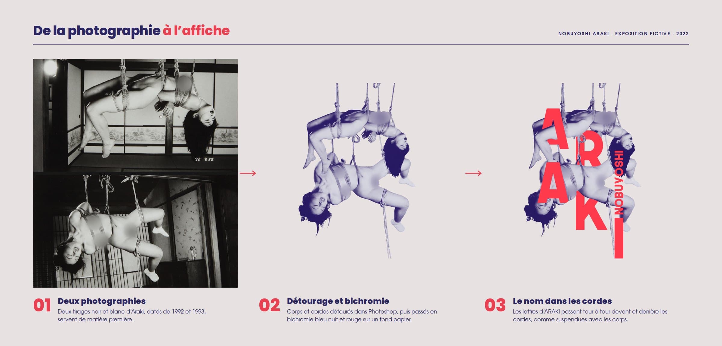
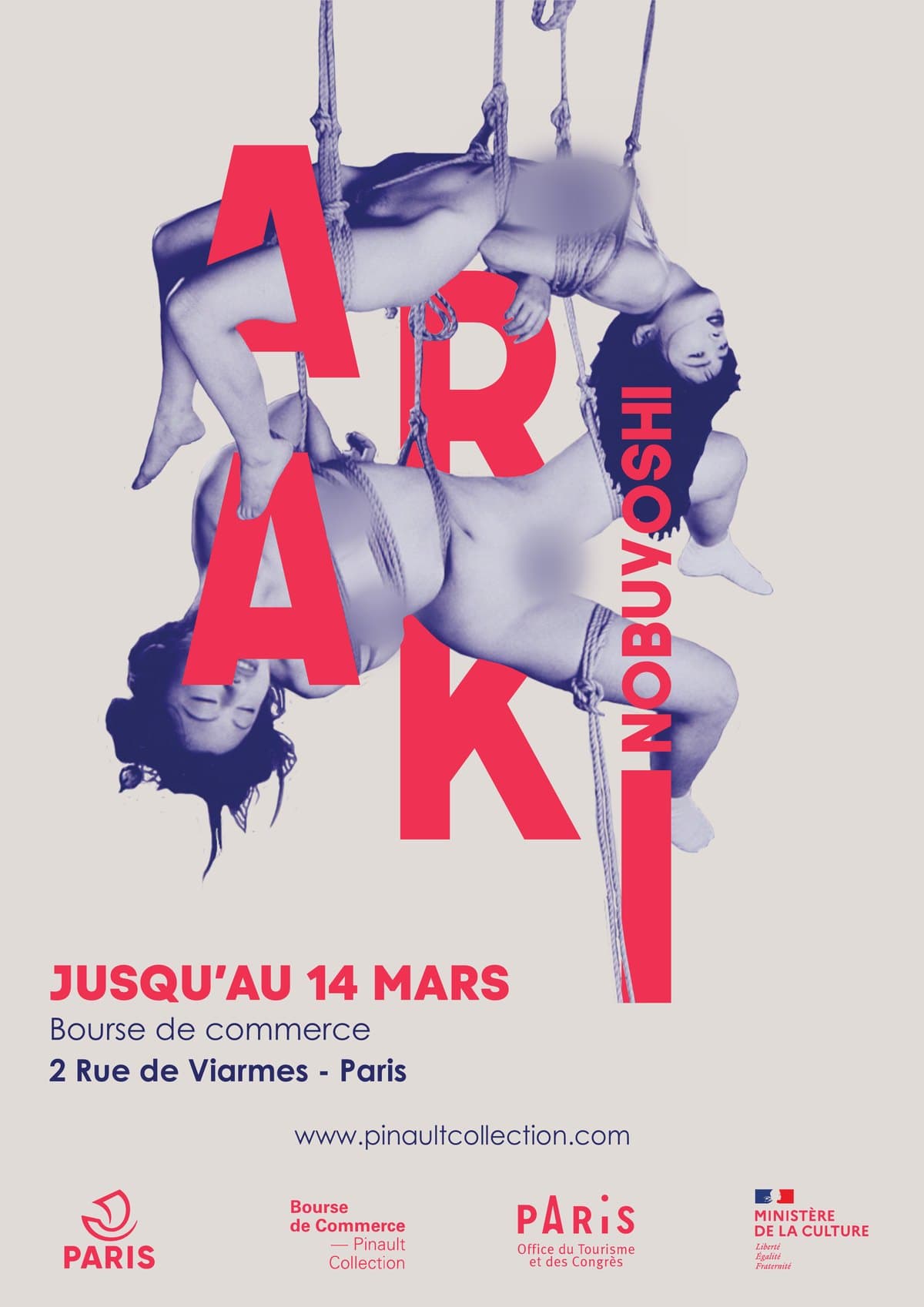
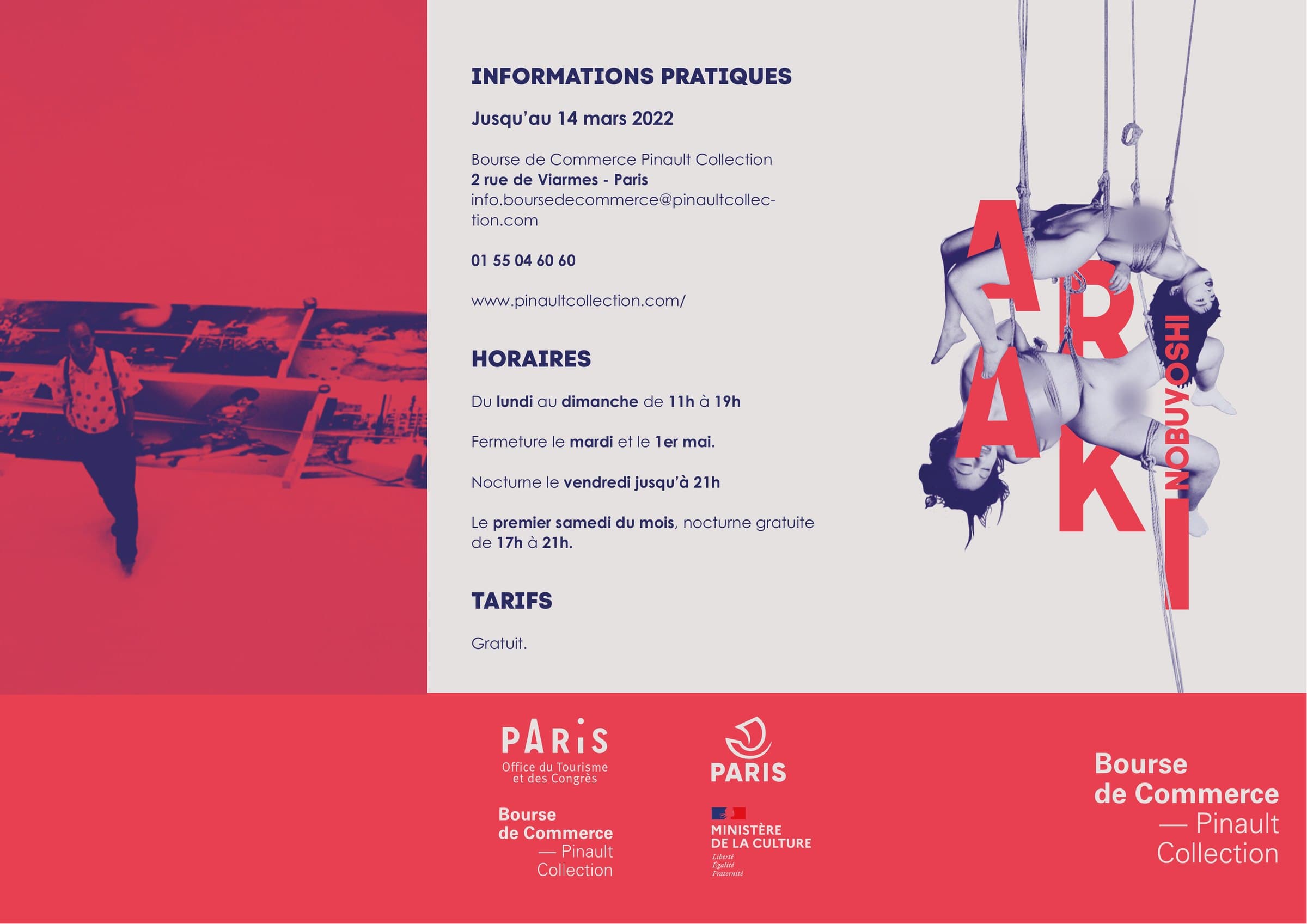
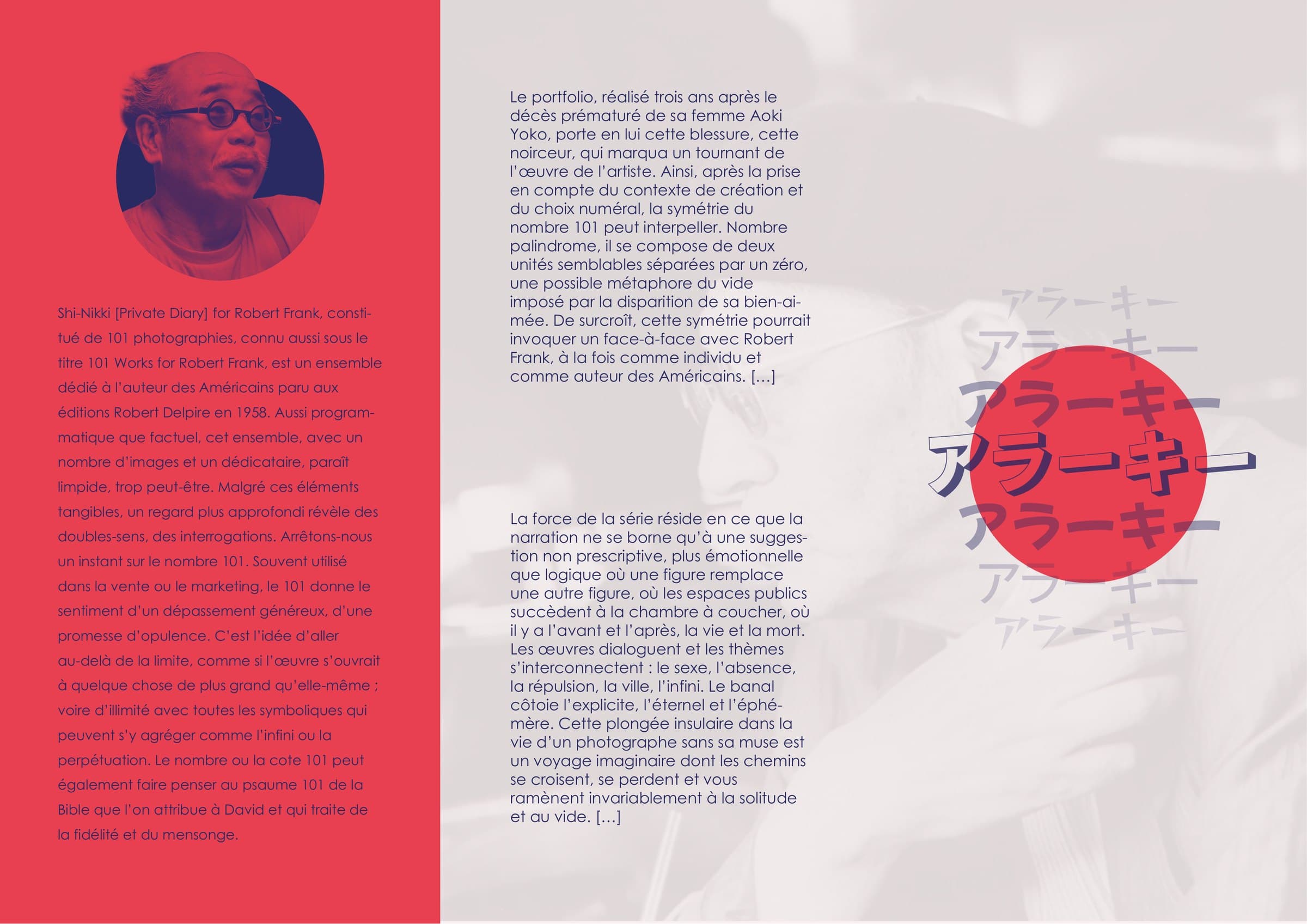
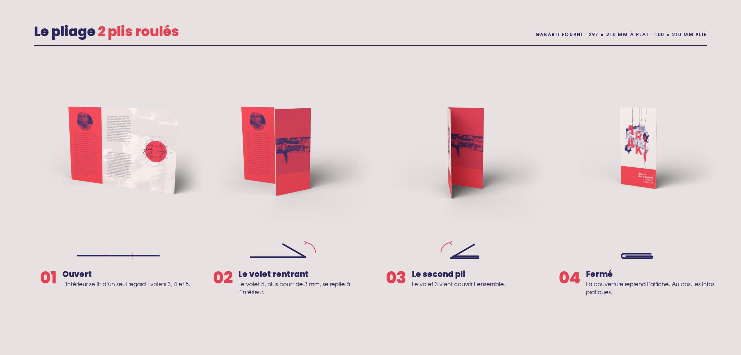
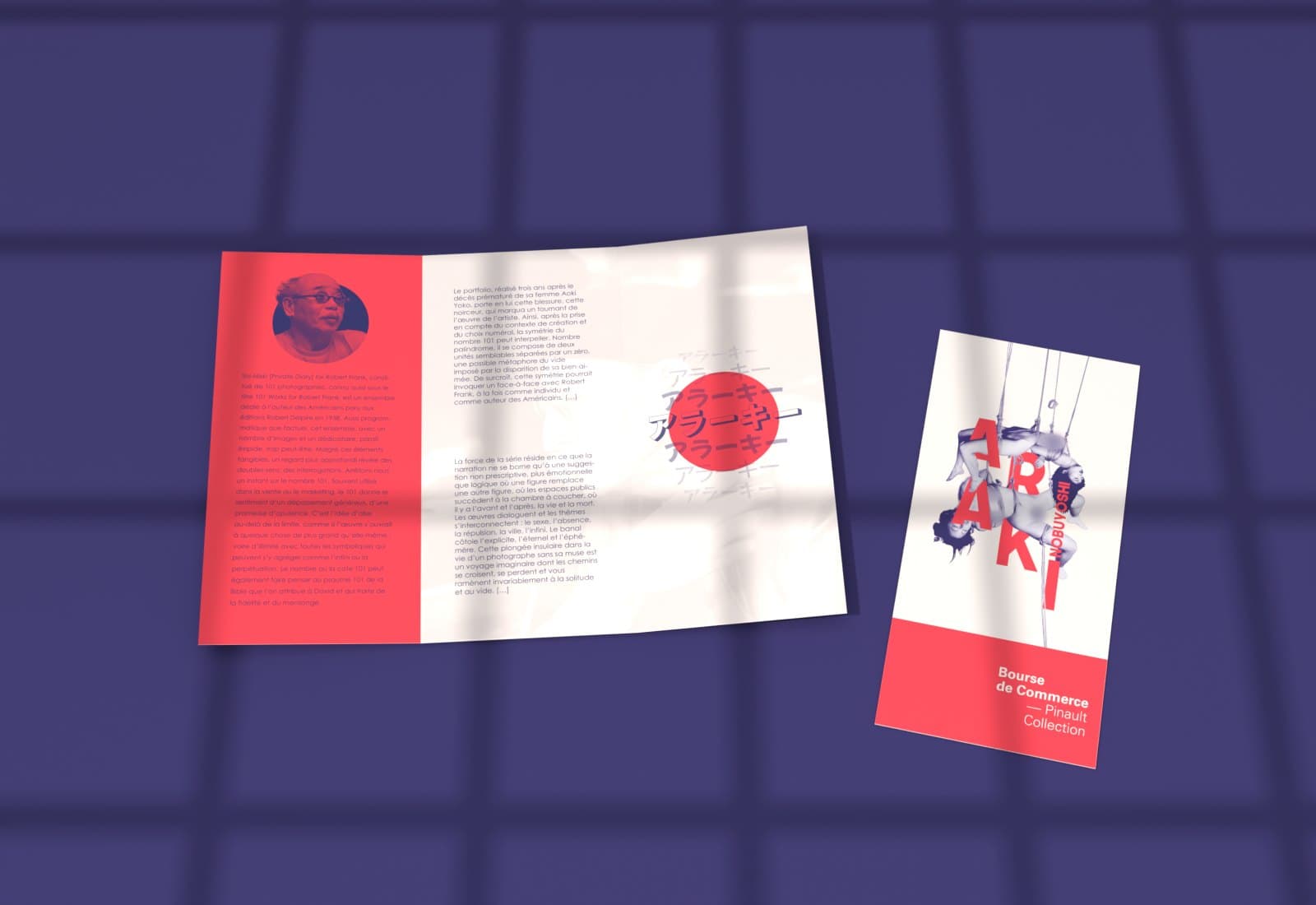
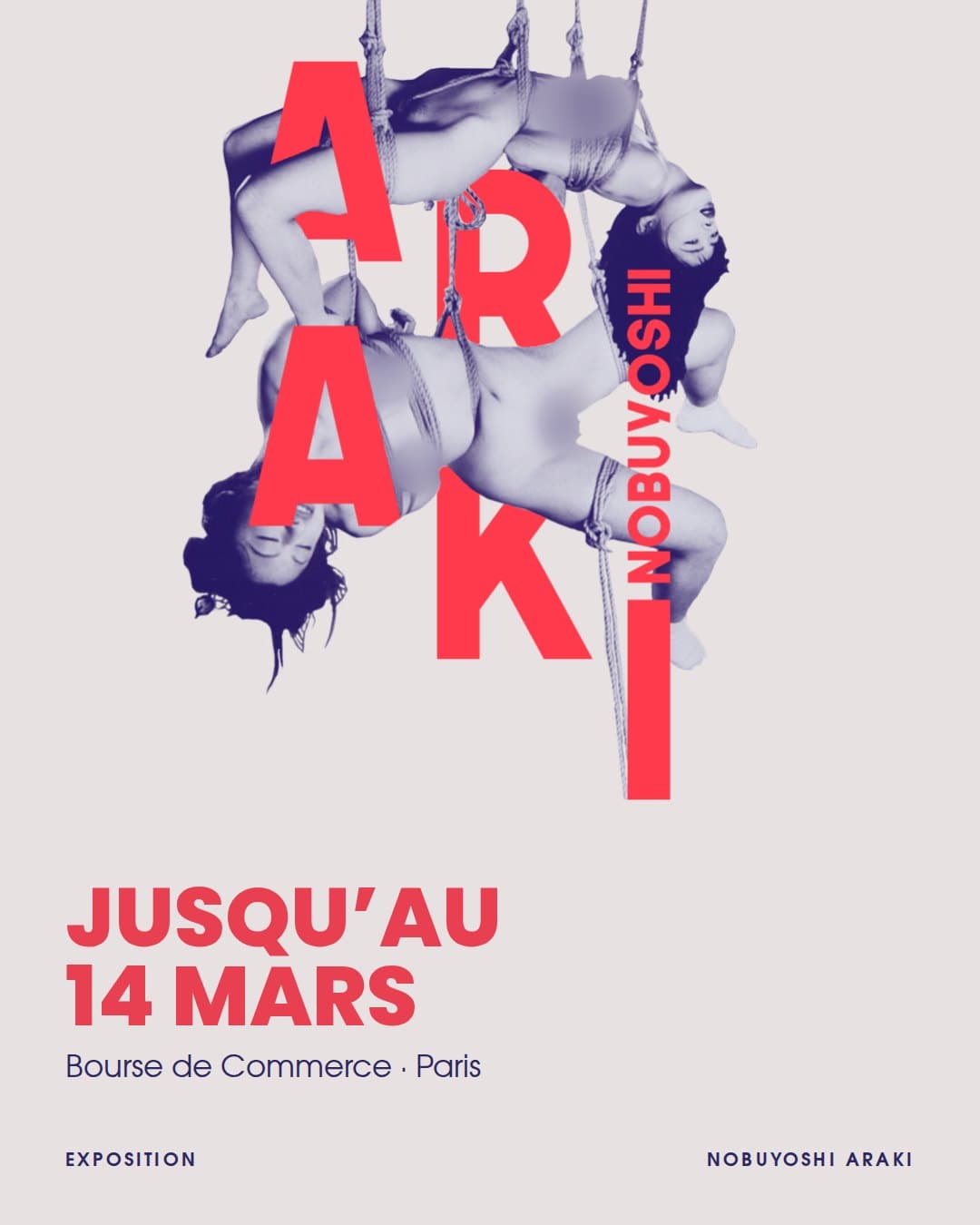
I ran the letters of ARAKI in front of and behind the ropes rather than laying the title over the image, so that the artist’s name and his subject read at a single glance. The name seems suspended with the bodies.
I turned the 1992 and 1993 prints into a night-blue and red duotone rather than keeping them in black and white. The red evokes Japan without copying its flag, as the first direction did, and the same palette holds the poster, the leaflet and Instagram together.
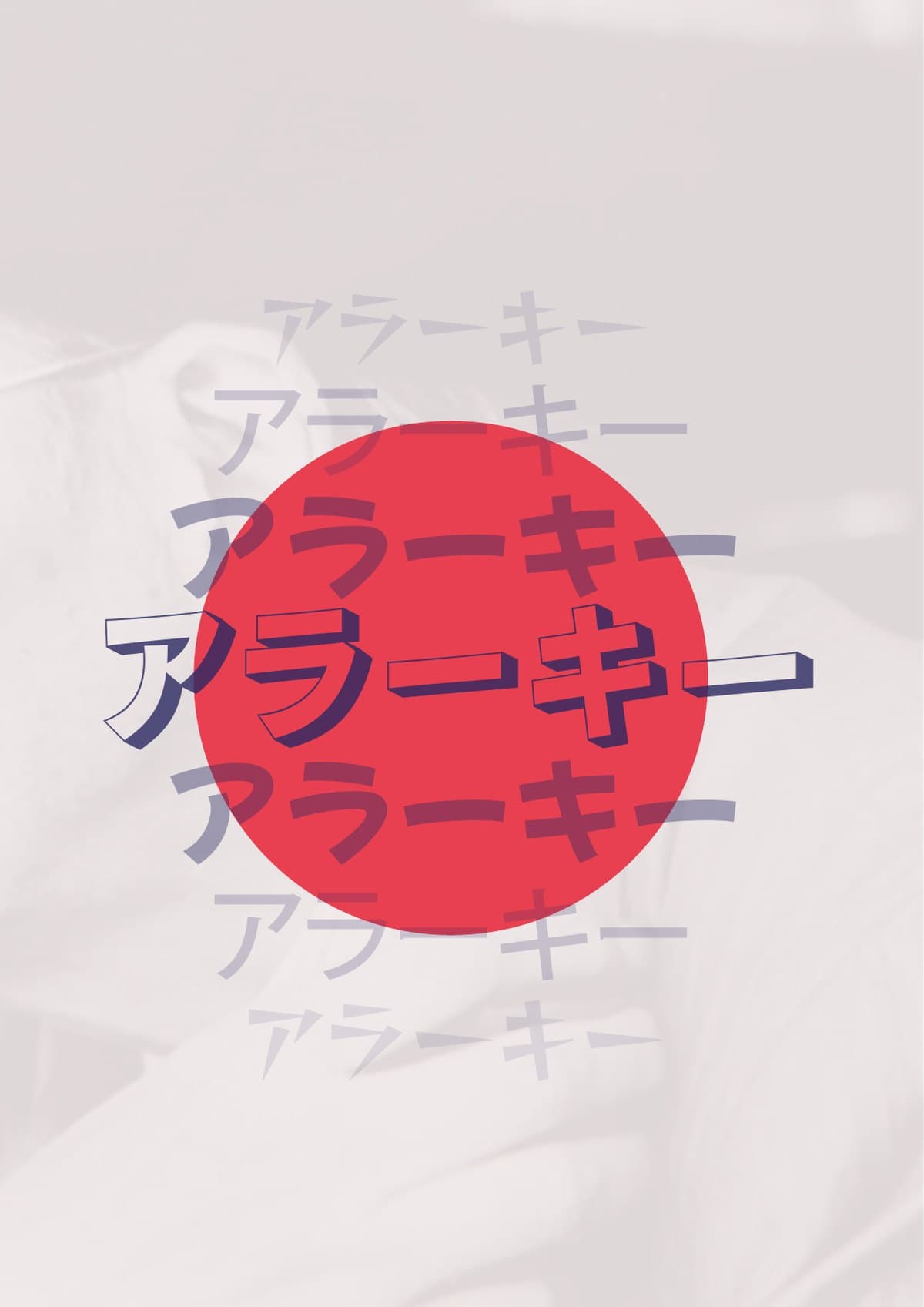
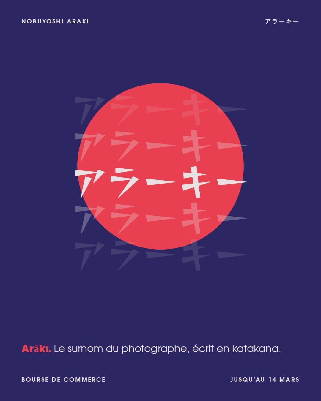
I used アラーキー, “Arākī”, the photographer’s nickname, as a motif inside the leaflet’s red circle. The Japanese touch comes through type rather than decoration.
Looking back, some inside photos of the leaflet were between 100 and 160 ppi, below the 300 ppi aimed for in print. Today I would check every image’s effective resolution before export, as I did for the poster photograph. This exercise taught me to think about the file before the image: trim size, bleed, folds, fonts.
Colours sampled from the project visuals.